Sunday 11 November 2018

Grandad Keeley


100 years on from the end of the Great War, today was a day for Remembrance.  As most of you are aware I usually paint landscapes but today I took some time out from that and chose to remember Grandad Keeley.  I was very young when he died so I have no memories of him as an individual but this is what I do know.  If any family members are reading this and would like to add to his story, there is a comments section below.

Michael Keeley was underage when he enlisted in August 1914 and joined the West Lancashire Royal Field Artillery.  His records were apparently destroyed during the Second World War so there is little information on his exact role and movements during the subsequent 4 years.  As I understand it though, he was assigned to the cavalry unit and worked with the horses throughout the war.  The picture above is based on a photograph from that time.  There is another photo of him at Toxteth Military Hospital from Christmas 1918 which suggests he was injured and repatriated towards the end of the war.  What he was doing on this exact day 100 years ago when the guns fell silent is something I'll probably never know.

We're lucky today that most of us will never truly appreciate the horror of war.  The lives we lead today and the freedom that we too often take for granted were hard fought for.  Grandad Keeley came home.  So many people didn't.  We should never forget that.

Wednesday 13 June 2018

Heading Home from Mull


It was about 5 years ago on a visit to Scotland that I took the photographs that were the source for this picture.  My sister and I had gone on a day trip to Mull and Iona.  We took the boat from Oban to Mull in the morning, passing this lighthouse on the way.  Looking back at my pictures, I had taken a couple of photographs and promptly forgot about them, they were not particularly memorable pictures.  The way home was a different matter entirely.  The calm sea and the low September afternoon sun cast a beautiful light over the scene and made some stunning reflections in the water.  It's amazing what a difference the right lighting makes.

At that time I was working mostly in watercolours and I knew that I wouldn't do this scene justice so I filed the pictures away, knowing that one day I would come back to them.  A few weeks ago I went on a colour theory course run by Colour Tutor.  We spent a very interesting day learning about saturation, tone and mixing along with many other topics.  I would highly recommend this course to anyone with an interest in colour.  Combined with a relatively recent move towards working in acrylic, it helped give me the techniques I needed to tackle this picture. 

Saturday 24 March 2018

Going home in daylight


The clocks go forward tonight which makes Monday one of my favourite commuting days.  If (big if) I was to leave the office at 5:30 and if (even bigger if) South Western Railway run on time, Monday is the first day of the year when I can arrive home in daylight.

Arriving in Canary Wharf on those dark January mornings can be a bit depressing.  Hundreds of us wrapped up in our winter coats, climbing up the escalators and preparing ourselves to make the quick dash through the rain into the office.  Most of us won't step outdoors again until we make the return journey in the dark later in the day.  This is why the arrival of daylight on Monday will be so welcome.

As those of you who follow me on Instagram will be aware, this first picture was built up over the course of about a month.  I had to be quite careful as I tried to map out the shape of the roof and the perspective on the escalators while still retaining a somewhat miserable atmosphere.  For the next one I wanted to work more quickly so I set myself the challenge of painting the other end of my commute at Fleet station in one afternoon.  I spend a minimum of 3 hours a day commuting and I spent 4 hours on this picture.  Somehow the 4 hours painting felt like a better use of time!

Sunday 12 November 2017

The American Dream

Just before Christmas last year, I received an email at work looking for volunteers to train as art guides for an exhibition we would be sponsoring as part of our celebration of 40 years in the UK.  I filled in the entry form and wrote my 100 words explaining why I thought I would make a good art guide.  A month later, I got confirmation that I had been selected.  The exhibition in question was The American Dream at the British Museum which ran from March to June.  My role was to act as a guide at a number of corporate events, hosting clients, the press and employees.  Each guide was allocated a room within the exhibition (I was in Made in California) and we spent the next two months learning about the artists, the pieces in the room and about the printmaking techniques they used to produce the work.  On the night before the exhibition opened to the public we hosted our first event and we put months of training and preparation into practice.  The evenings themselves flew by and I thoroughly enjoyed every minute I spent there.  I wanted to put some of what I learned into practice and so I started a series of paintings inspired by the work in the exhibition.  I don't have a printmaking studio so I turned instead to a medium often favoured by the pop art movement and used acrylics.  And because this all happened because of work, my office was the obvious place to start when looking for subjects.

Wayne Thiebaud was one of the earlier pop artists and is well known for his depictions of cakes and confectionary using bright, bold, somewhat synthetic colours and geometric shapes.  Early in his career, he worked at a Long Beach fast food joint and this inspired much of his work, Boston Cremes (1970 linocut) being an example.  Thiebaud often worked from memory and so, following his lead I started on donuts.  Trays of donuts are a regular feature around the office and are usually a hint that someone nearby is celebrating a birthday or other significant event.  One of the things that struck me with some of the pictures we were looking at was how effective relatively few marks can be.  In Ed Ruscha's OOO (also 1970), the use of a shadow and highlights make the words appear liquid although the image itself is remarkably simple.  I tried to use this approach to put the glossy icing on my donuts. 

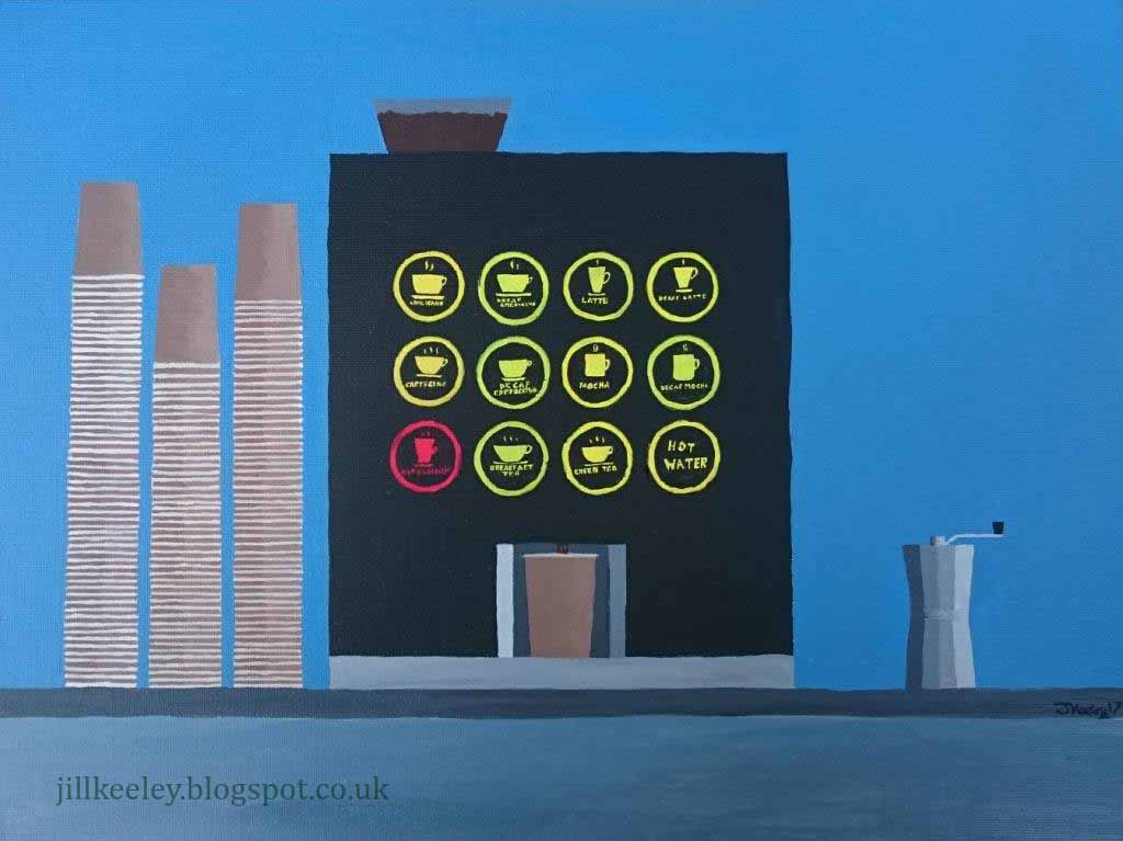
Having got myself started with a reasonably simple image, I turned my attention to a theme that ran right through the exhibition - every day objects of mass consumerism.  One of Thiebauds most iconic images is Gumball Machine (1970, linocut).  Thiebaud described this as a reward system, you put something in and you get an instant reward.  With the office coffee machine we simply select from a baffling array of options, press a button and out it comes.  We don't even have to wash up afterwards, preferring instead to fill up landfill sites with our disposable single use cups.  Of course there's always one (you know who you are) who thinks this is all far too easy and insists of grinding his own coffee beans every morning for an altogether more satisfying coffee experience.  It would have been rude not to acknowledge his efforts here.  I worked from memory again on this one and I noticed that this approach was starting to make me pay more attention to the things around me.  I'd never really thought about the different shaped cups on the pictures on the machine before.  Or about how pointless that is when you have to put a standard sized cup on the tray so the machine can squirt the correct amount of liquid in without it overflowing.  By the time I had finished I never wanted to see another paper coffee cup for the rest of my life but it was worth putting the time in to get it right. 

Moving on from California, one of the images that struck me in the rest of the exhibition was Richard Estes 560 which was a part of his Urban Landscapes series of screenprints from 1972.  I was particularly interested in the reflections in the glass of the somewhat anonymous office building.  It was pretty obvious where I needed to go next.  Estes worked from photographs so I allowed myself some source material this time.  I took several pictures of the front of our office and printed one in black and white so I wouldn't get too distracted trying to make the colours match.  Much to my surprise, once the initial drawing was complete, I didn't actually use the photo much.  The lack of people in Estes picture makes the place feel eery and unwelcoming. While I wanted to capture an element of that, I did want to have some human presence so there are 3 people in my finished piece although one of them has faded into the background so much that I'm starting wondering if he's gone for a coffee.  The reflections in this picture were hard to do, particularly once I got to the revolving doors.  I lost my way a bit when I got to that point and abandoned the picture for several months over the summer.  It was a return visit to the museum last week that sparked my enthusiasm again and triggered me to finally finish it.

The artists featured in The American Dream used a multitude of printmaking techniques and having finished my paintings, I am left in awe at the level of skill and patience required to turn these images into successful prints.  It's easy for me to make a correction with acrylics when something doesn't go quite the way I wanted it to.  If I had spent months cutting a series of templates out of a sheets of lino, a mistake would have been hugely frustrating.  Being an art guide was an incredible experience.  The research we did and the training we were given, combined with my own project exploring some of the themes of the exhibition has given me an appreciation of a whole genre of art that I'd never paid much attention to before.  Thank you to everyone involved who made this happen for us.


Sunday 22 October 2017

The Kirkudbright Boat Project

On a visit to my sister's house in the summer, we took a day trip to the town of Kirkudbright.  We went to the Tolbooth Gallery where Henrietta Veys-Crocker had an exhibition of boat and seascape pictures.  She was in the gallery as we were looking around and I spent some time chatting with her about her work.  Boats are a subject matter I've always struggled with as they're a funny shape and the curves never seem to come out quite right.  She suggested I try turning the page upside down as the curve that your hand makes as you bring your arm around makes the shape easier and free-er.  Inspired, I came home and proceeded to paint hundreds of pictures of boats....most of which are now in my recycling bin.  But as I persevered, a couple of them started to come out looking vaguely boat shaped so I thought I'd share those with you today.  Both are pictures of abandoned boats in Kirkudbright which sit along the riverbank.  I've taken photographs of them on previous visits thinking they'd make good subjects for a painting one day but have never quite known what to do with them.

The first picture was done in pastels and I'm quite pleased with the colours as I think they show a hint of the scruffy abandoned nature of the scene.  But it is still a bit misshapen at the back and very nearly went the same way as everything else into the recycling.  Frustrated, I decided to pack my paints and pastels away and go back to basics with a pencil.  It was the right decision and this drawing is the only boat picture I produced that I'm actually happy with. 

I went to a demonstration recently at the Fleet Art Society and the artist presenting talked about the importance of sketchbooks for building up your ideas and composition.  I'm particularly bad at this and I have a tendency to launch straight into my pictures without too much thought.  Clearly this didn't work when tackling a subject matter I found difficult.  With some practice and perseverance, I did manage to eventually produce something I was happy with but I was thoroughly sick of boats by the time I did.  Maybe if I'd approached the exercise the other way around and tried more practice drawings and sketches before putting pressure on myself to produce a finished painting then I'd have had better results and a less frustrating time getting there.  I'm off out to buy a new sketchbook but in the meantime, I hope you enjoy these pictures more than I did!


Saturday 29 April 2017

Dolomites

 The Dolomite Mountains in northern Italy have been on my travel wishlist for several years now and last summer I finally went there on a week long hiking trip with my friend Dawn.  We had booked a trip through Sherpa Expeditions where we walked from one village to the next our bags were moved on for us.  It was a great way to travel as every day we were waking up somewhere new but we didn't have the added burden of carting our entire lives around in gigantic backpacks.  All the  routes were meticulously planned out with detailed instructions and maps so all we had to do was turn up and enjoy the holiday.  We couldn't really ask for better than that.


Needless to say, I took hundreds of photographs and came home wondering where to begin.  I had taken a bit of a break from painting so to get myself started again, I picked a church in Colfosco, one of the little villages we stayed in.  These little white churches are dotted around all over the place so really do represent the area.  I often start with drawings when I haven't done anything for a while - it helps me get back into it again.  I had recently bought some acrylic inks with some birthday vouchers (thanks Sonya!) so I was playing around with these in my first picture.  Many of the hotels we stayed in had old sepia photographs on the walls so this is the look I was going for here.  I think I need a bit more practice with the inks - they dry very quickly so I sometimes found I got a few too many brush marks where I hadn't expected them but overall, this was not a bad warm up exercise.

We weren't really there for the churches though, we were there for the mountains so this was the focus of my second picture.  As you make your way through the mountains, every now and then you pass a little wooden hut with a chimney.  They're there for hikers to sleep for the night.  There are a number of longer distance routes that take you through the whole mountain range, stopping in these camping huts each night.  I was glad we had chosen the more luxurious option for our trip although there is a part of me that could be tempted by the camping option one day.

I stuck with drawing for this.  I like the way the rocks behind the church came out in the first picture and wanted to take that further.  The rocks are, after all, what makes this place so distinctive.  When the light hits them, particularly in the early morning or late afternoon, the shadows create some really interesting shapes.  This picture took ages but I'm pretty happy with the result.

Finally, I went back to my pastels.  Having spent so long on the details in the previous drawing, I was ready to step back and just go for it with this one.  I didn't really know how it was going to turn out but I thoroughly enjoyed the process of finding out.  This picture was from the most memorable day of the trip for me.  We took the gondola up to the top of a mountain.  It was baking hot when we set off and absolutely freezing at the top with a biting wind.  There are many remnants of the First World War up here and we spent an hour or so at the top walking past huge craters blown out of the side of the mountain with dynamite, through old trenches still with their rolls of barbed wire in plan and past tunnel systems dug into the rocks where soldiers lived.  On a sunny day in August it was cold.  In the middle of winter with limited resources and and opposing army trying to blow you up at every opportunity, it must have been brutal.  It was a sobering remainder of just how lucky we are.  I haven't found a way yet of painting the remains of war and doing them justice so the view in this picture is from standing with my back to them.

Sometimes, when you visit a place you've been wanting to see for a long time, the reality doesn't quite live up to expectation.  With the Dolomites I'd say the opposite was true.  This is a truly beautiful and awe inspiring place and as we left, my parting thought was "why has it taken me so long to come here?"


Sunday 23 October 2016

Sunrise at Fleet Pond

On a freezing cold day back in January, I had an appointment at the dentist to have a filling replaced.  Knowing how quickly the station car park fills up, I drove up early and parked my car then found myself with half an hour to kill before I went for my appointment.  Those of you who know Fleet will be aware that the station is right next to Fleet Pond, a nature reserve that has featured previously in this blog.  It was an icy day and the pond was completely frozen over so I decided to spend my time watching the sun rise.  It was a beautiful morning which was inevitably going to end up in a painting one day.  It took a couple of months for me to come back to it.  This is often the case as I mull the picture over in my head, trying to work out what I want from the end result.  In this case it was the blues and pinks of the sky that stayed in my mind so that's what I set out to capture. I used a watercolour under-painting, followed by pastels - a technique you'll have seen me use once or twice before.  


Having finished this picture, I took a bit of a break from painting over the summer, I focusing instead on landscaping the garden. Those of you who also paint will know that after a break, it's sometimes hard to get back into things and when I returned to my easel I was at a bit of a loss as to where to begin.  I've stopped parking my car at the station now (the cost is ridiculous) and instead use my parents' driveway which is a 10 minute walk away round, you guessed it, Fleet Pond.  So now I get these fabulous sunrises every single day of the week.  It seemed an obvious place to start - pick up again where I left off.  The next few paintings ended up in the bin.  I couldn't seem to get what was in my head out onto the paper and I screwed them up in frustration.  This afternoon I decided to just spend some time playing around with a few sketches which was exactly what I needed to do.  This is one of them - another sunrise using Pan Pastels.  Pan Pastels are pastel pigment compressed into a dish and you apply them using either your fingers or sponges.  I opted for sponges this time, something I haven't really tried before but will definitely be doing again.  I stopped myself from adding too much detail on the reed banks, choosing instead to just hint at them with the green.  I love the end product and as it was supposed to just be an experiment it has come as a bit of a surprise.  Now I'm left wondering what I can do next with these lovely little pots of colour but for now I'll leave you with today's efforts.